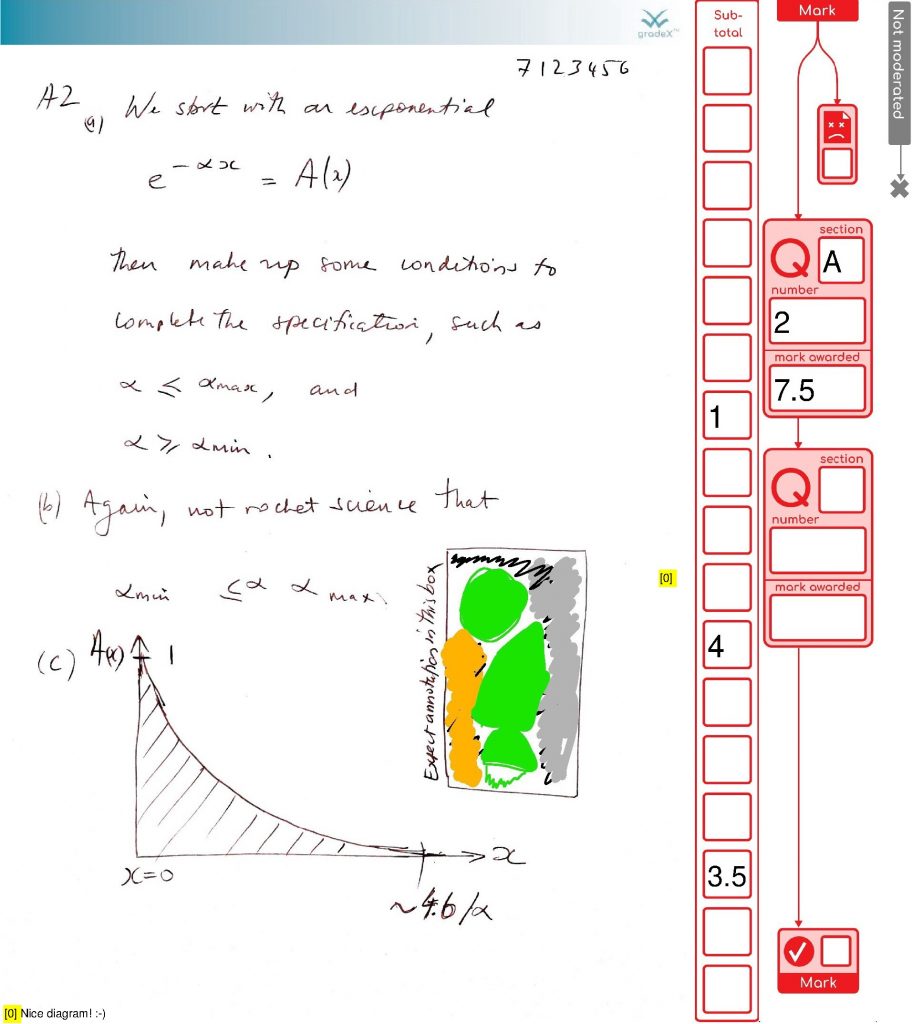
This post is actually about two different types of comments …
- feedback from a colleague
- how we can use/handle pop-up comments
The post title reflects me realising that I wanted to support pop-up comments in the pdf-handling bit of the gradex™ tool…
1. Feedback on the marking process
Overall, I think it’s cool. As long as we can get students to upload stuff that is readable I think it should be possible to mark at pretty much the same speed as normal.
An Anonymous Colleague
Awesome, I am pleased with that. Avoiding time wasted with the tool is one of the main goals – use effort for marking, not marking up.
And here is one that should be suitable to follow through as a worked example for the web page.
.. The Same Colleague
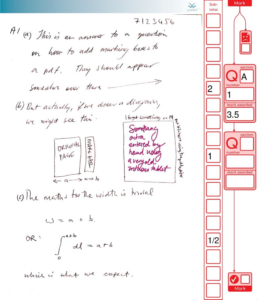
Page 1 – normal marked page, one comment and addition should be correct
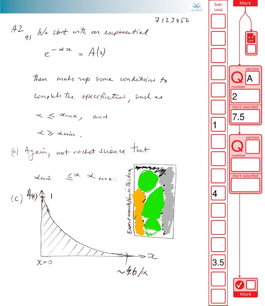
Page 2 – marked page but should have an adding up error (to show how this will be moderated)
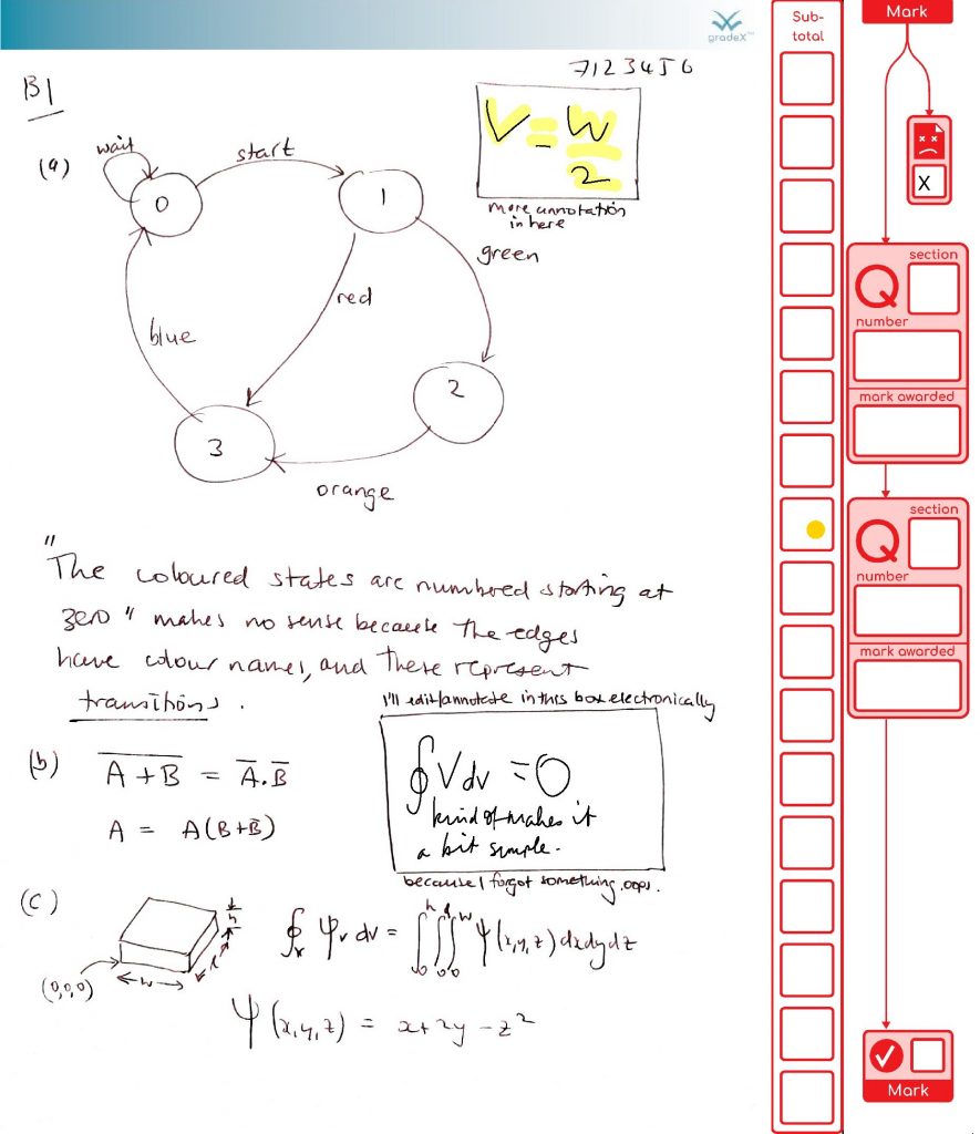
Page 3 – I’ve checked the box at the top to indicate that I can’t read it (assuming that is what the box is for)
Here’s a look at their marked-up file (images-only )
This is a great example of how marking will get done – careful consideration, some half marks, a simulated adding mistake (it happens in real life from time to time, so we have processes to catch it) and a duff page getting flagged (that page wasn’t duff, but we’re using our imagination).
2. Handle those pesky virtual post-it comments
Seeing the use of pop-up comments in this marking demo, made me realise I wanted to handle them in the gradex tool. They reduce your cognitive load (you can park some parts of your thoughts on paper to focus on other bits). It’s unlikely that students will use comments on their scanned exam scripts, but they might. Markers definitely will. For marking in PDF, comments do produce some difficulties though:
- PDF readers don’t respect read-only settings
- Ghostscript doesn’t flatten them to the page image like the other annotations (see images above!)
That means I need to handle them myself, and flatten them in some way, so that they cannot be edited in a rogue non-compliant editor.
It just so happens that both comments in this marked document popped open to cover over parts of the marking area where there could be important information. So I can’t just flatten them where the document says to put them, because they would permanently obscure important information. I thought through a bunch of options
- stashing the comment text within the document, then duplicating the comment in a new pop-up
- putting comments in special part of the sidebar*
- putting comments in a special header or footer
- finding out which editors respect the readOnly flag and putting the rest on a “do not use” list.
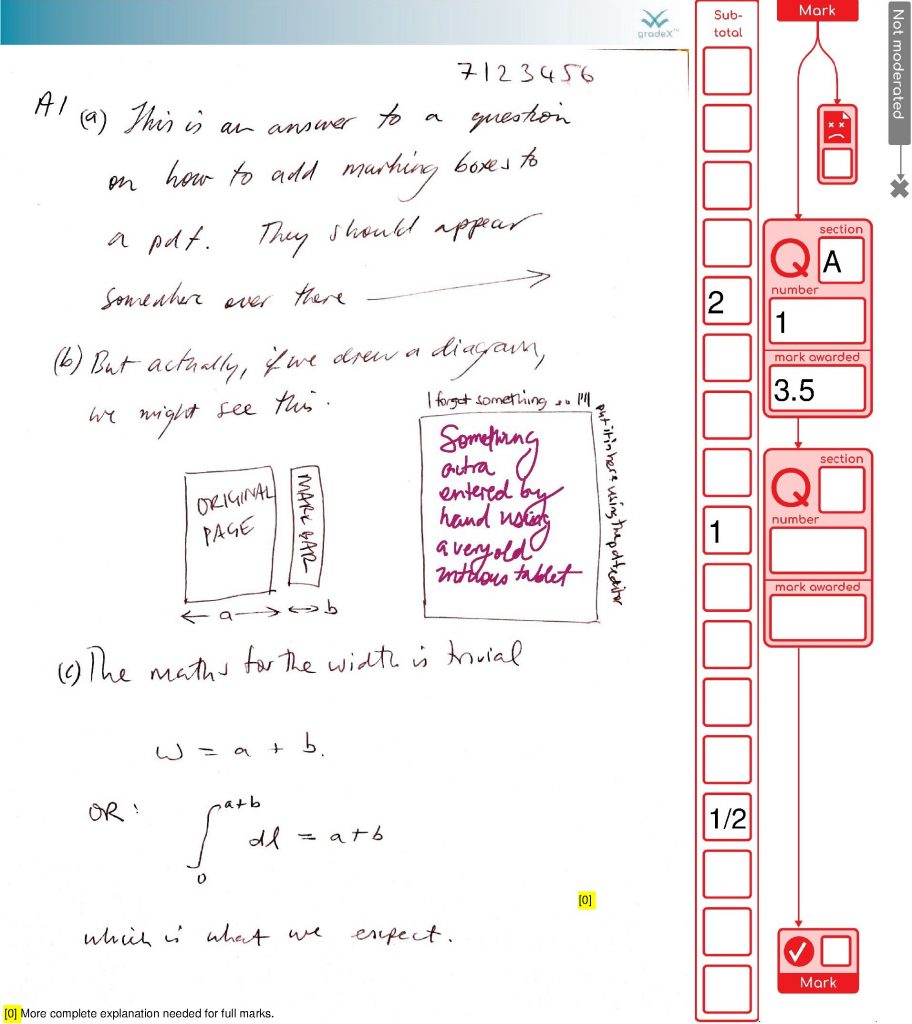
These approaches all have wrinkles or gremlins. The least worst option is to stash comments in a reserved area so that nothing is overwritten. So I have made a space to investigate putting comments in the sidebar, once I have prefill text fields implemented in a general way. For now – I’m writing them to the bottom of the page. I’m also putting in a yellow numbered marker where the comment was located, because position is important context.
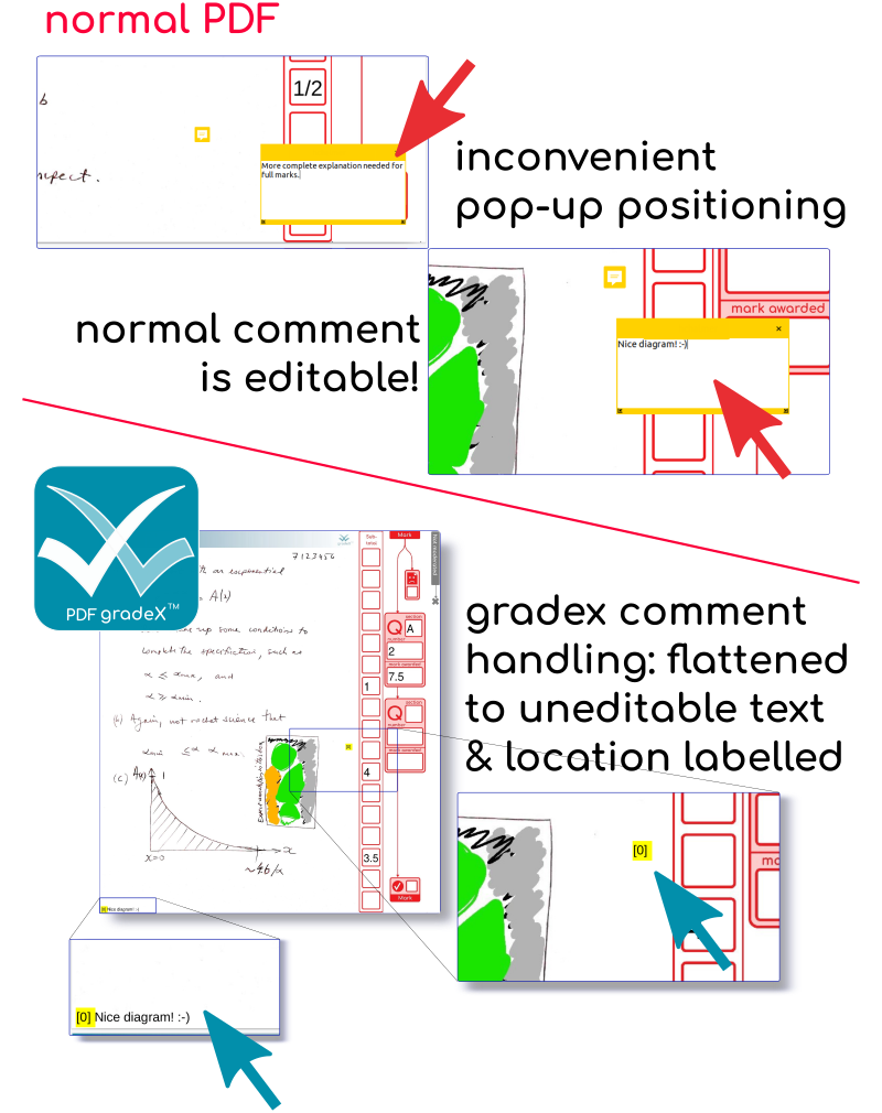
These two pages (the two with comments) don’t look that different with the comments on. There is a chance of conflicting with student work at some point …. hence the plan to shift it into the sidebar if possible. Meanwhile, even if it is not as pretty as the grids, at least we’ve captured and preserved the comments. Phew.
Postscript (sorry not sorry)
The more you dig into PDF, the more you start to have thoughts about its clunkiness compared to web markup – these are well articulated by others (like this). The TLDR is that we’d do things differently now we are more worried about security more than we are about performance – and avoid structures that permit infinite cycles.
You know it’s a serious when the CEO of a software house is dropping comments like this in their code (presumably from a code review):
GH: Are we fully protected against circular references? (Add tests).
But it’s not bad for a library that’s older than the average age of the students sitting the exams. And the structure diagrams are pretty – if you aren’t thinking about parsing it!

