So you’ve got some exams to mark and wondering what the process is like? Here’s a quick video to give you an idea
https://www.youtube.com/watch?v=jIs0a4yU2tU
So you’ve got some exams to mark and wondering what the process is like? Here’s a quick video to give you an idea
https://www.youtube.com/watch?v=jIs0a4yU2tU


This post is actually about two different types of comments …
The post title reflects me realising that I wanted to support pop-up comments in the pdf-handling bit of the gradex™ tool…
Overall, I think it’s cool. As long as we can get students to upload stuff that is readable I think it should be possible to mark at pretty much the same speed as normal.
An Anonymous Colleague
Awesome, I am pleased with that. Avoiding time wasted with the tool is one of the main goals – use effort for marking, not marking up.
And here is one that should be suitable to follow through as a worked example for the web page.
.. The Same Colleague
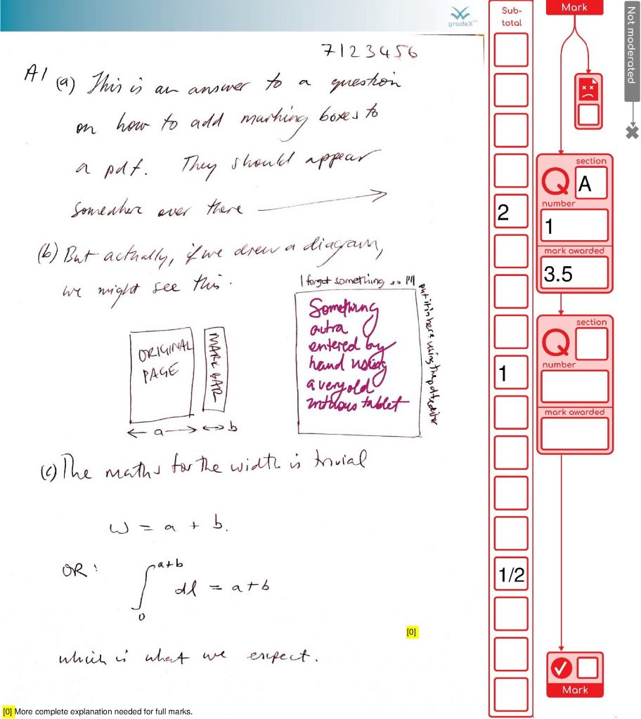
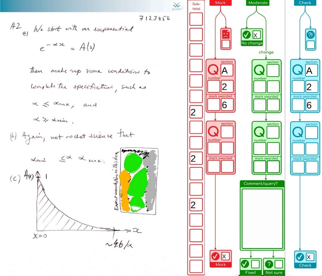
Page 1 – normal marked page, one comment and addition should be correct
Page 2 – marked page but should have an adding up error (to show how this will be moderated)
Page 3 – I’ve checked the box at the top to indicate that I can’t read it (assuming that is what the box is for)
Here’s a look at their marked-up file (images-only )
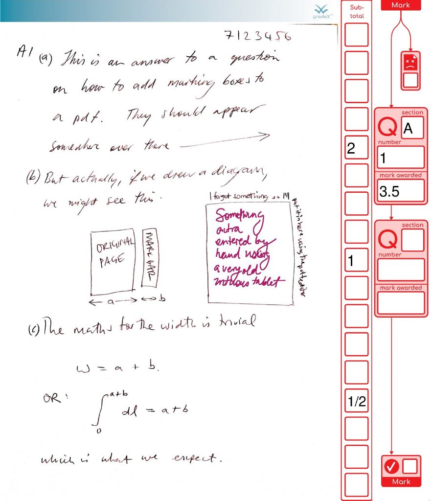
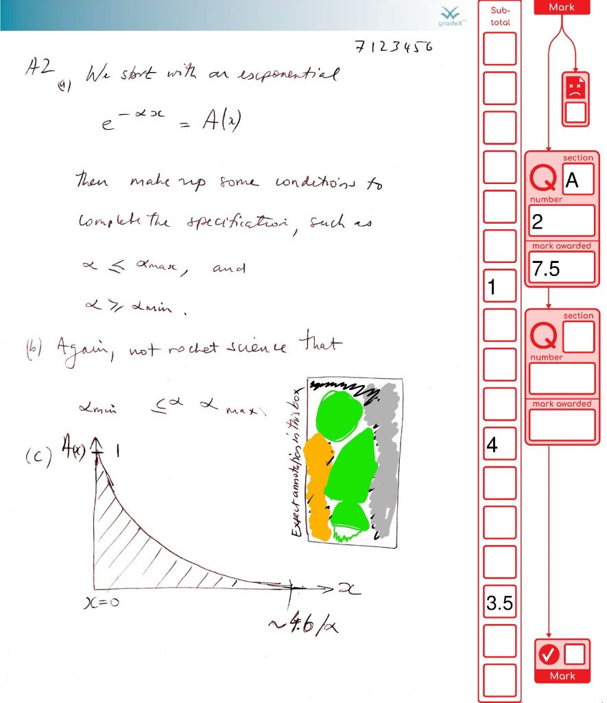
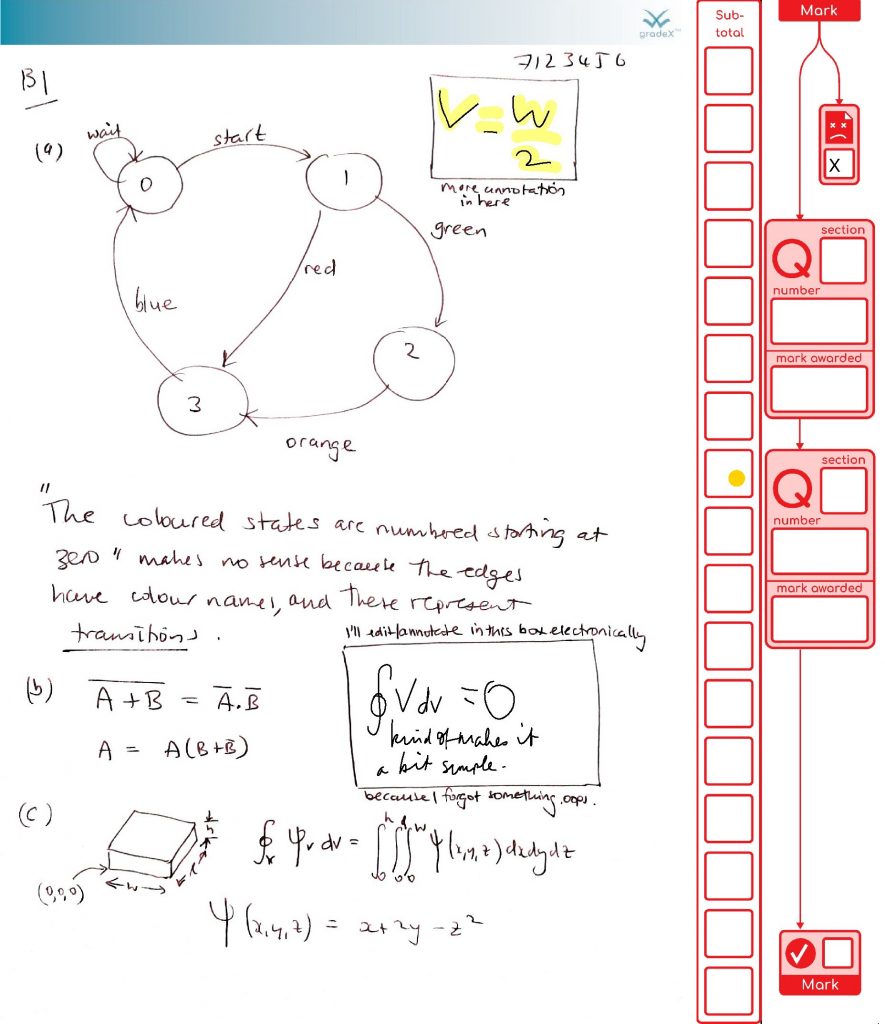
This is a great example of how marking will get done – careful consideration, some half marks, a simulated adding mistake (it happens in real life from time to time, so we have processes to catch it) and a duff page getting flagged (that page wasn’t duff, but we’re using our imagination).
Seeing the use of pop-up comments in this marking demo, made me realise I wanted to handle them in the gradex tool. They reduce your cognitive load (you can park some parts of your thoughts on paper to focus on other bits). It’s unlikely that students will use comments on their scanned exam scripts, but they might. Markers definitely will. For marking in PDF, comments do produce some difficulties though:
That means I need to handle them myself, and flatten them in some way, so that they cannot be edited in a rogue non-compliant editor.
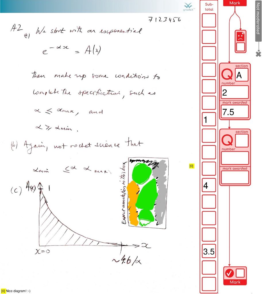
It just so happens that both comments in this marked document popped open to cover over parts of the marking area where there could be important information. So I can’t just flatten them where the document says to put them, because they would permanently obscure important information. I thought through a bunch of options
These approaches all have wrinkles or gremlins. The least worst option is to stash comments in a reserved area so that nothing is overwritten. So I have made a space to investigate putting comments in the sidebar, once I have prefill text fields implemented in a general way. For now – I’m writing them to the bottom of the page. I’m also putting in a yellow numbered marker where the comment was located, because position is important context.
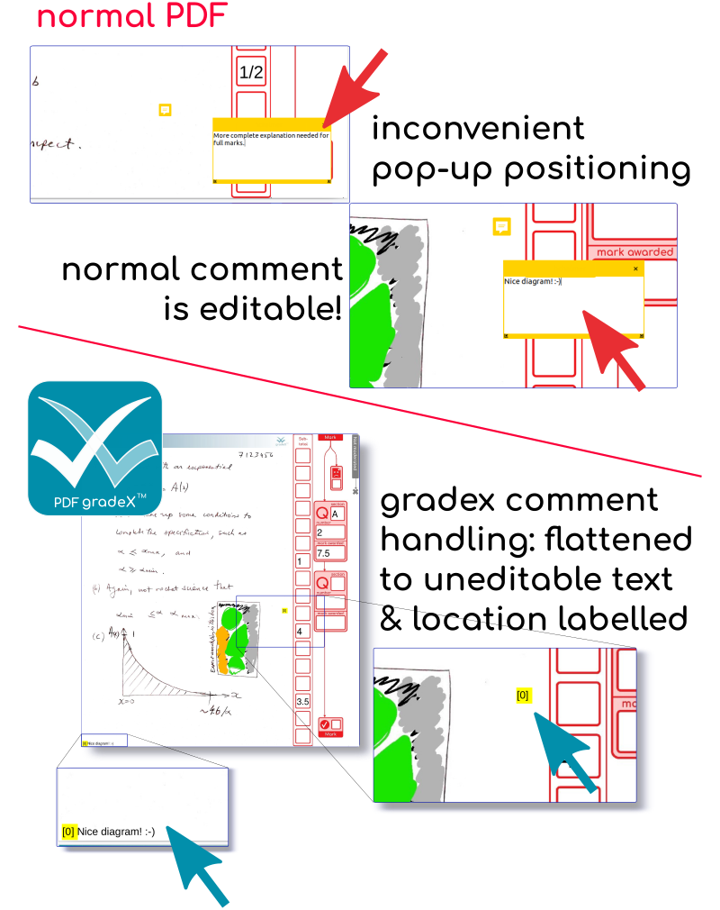
These two pages (the two with comments) don’t look that different with the comments on. There is a chance of conflicting with student work at some point …. hence the plan to shift it into the sidebar if possible. Meanwhile, even if it is not as pretty as the grids, at least we’ve captured and preserved the comments. Phew.
The more you dig into PDF, the more you start to have thoughts about its clunkiness compared to web markup – these are well articulated by others (like this). The TLDR is that we’d do things differently now we are more worried about security more than we are about performance – and avoid structures that permit infinite cycles.
You know it’s a serious when the CEO of a software house is dropping comments like this in their code (presumably from a code review):
GH: Are we fully protected against circular references? (Add tests).
But it’s not bad for a library that’s older than the average age of the students sitting the exams. And the structure diagrams are pretty – if you aren’t thinking about parsing it!

As an Academic doing marking with this system, you don’t need any software other than a PDF reader ( that can speak acroforms). Then you will just a file formatted something like this (preview below), which you then edit, save and return.
The design is flexible so it can be changed to suit feedback or different procedures in different unis.
I learned that a lot of PDF viewers have patchy implementations, so you get a nicer experience if you go with
Things that DON’T work, or have quirks
Here’s an original submission, with no pdf.gradex™ treatment. You can delete the annotations. Oops!
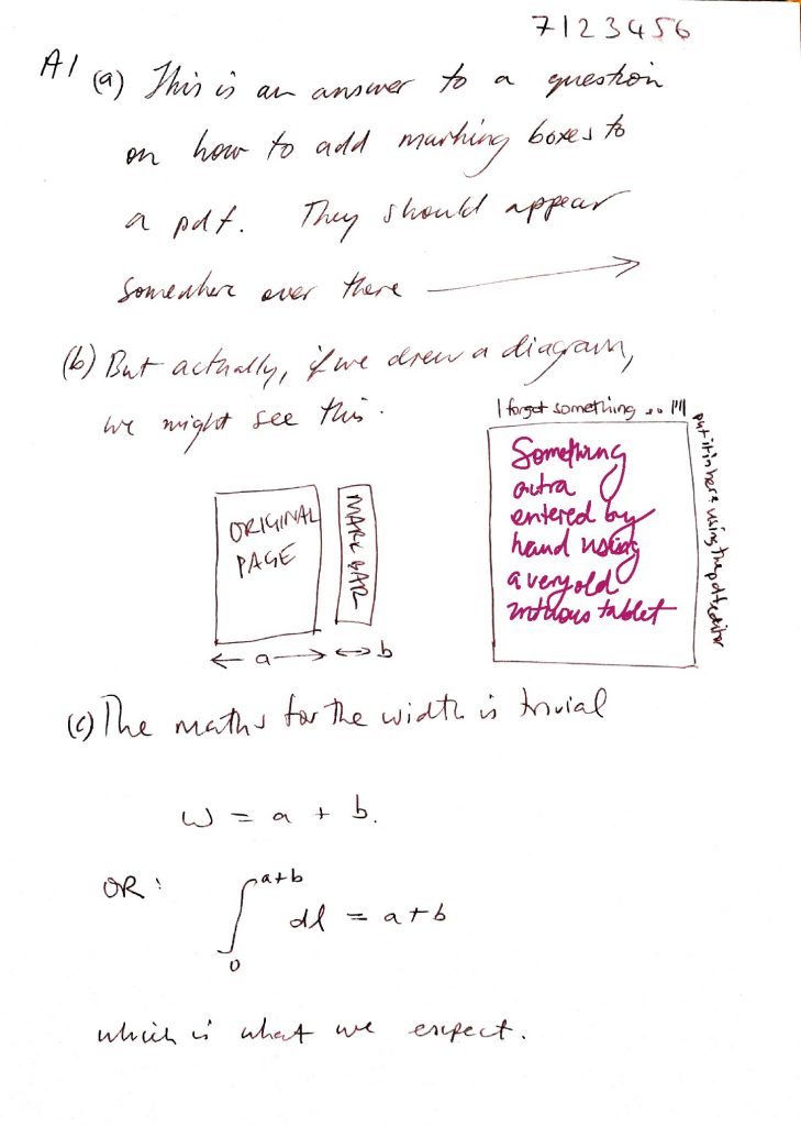
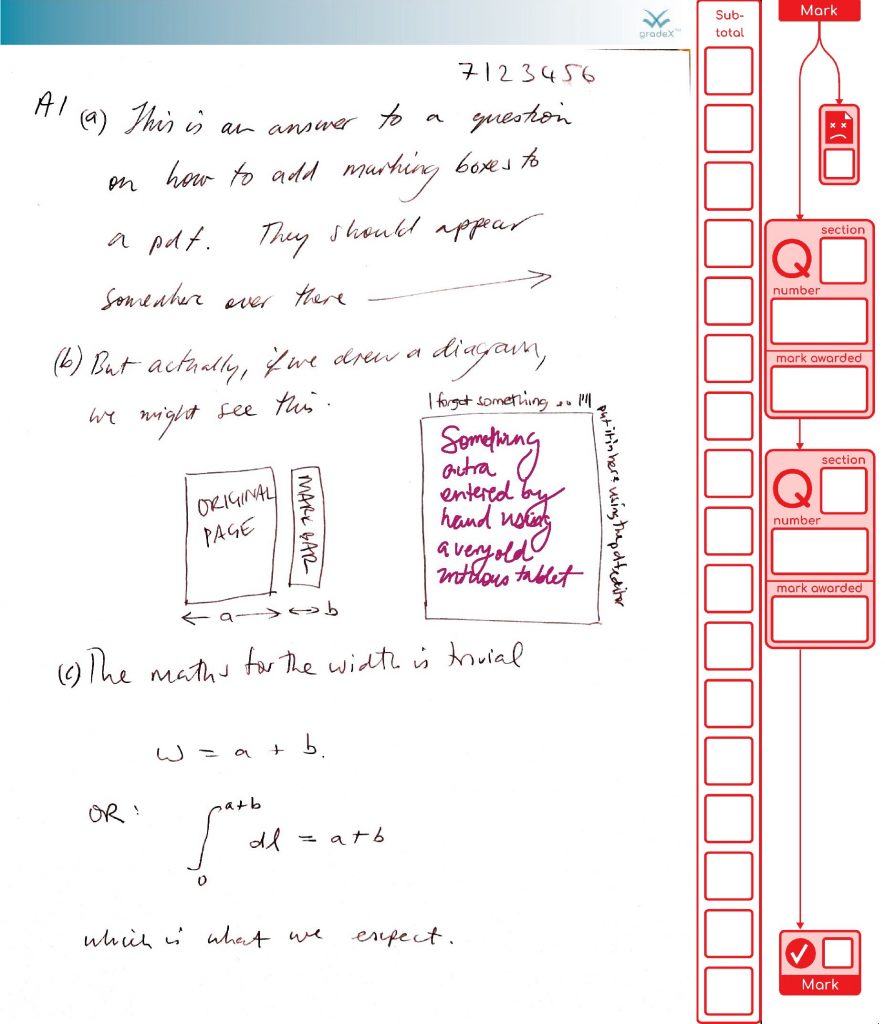
If you fancy seeing what happens to your work next, send me your edited form (and let me know if I can post here ….)
Work were kind enough to give me a blog spot to talk about this project:

That also provided the impetus to put up a quick demo release. I do my dev on linux, but it seems pretty standard across the people I’ve sent demos to (Canada, Scotland) that teaching offices are using Windows 10. You can get the demo code from github. If you want to experiment with your own layouts, then there is information on the editing process in the demo README.
Even though I know it is a good thing in projects like this, the curse of YAGNI is always in your mind when you are sinking time into automation processes with their usual little wrinkles that (hopefully) no-one else need ever be burdened with. It started to pay off today, already. I had some user feedback on the grid design, and within 10min of the call ending, I had the design revised and working. I’d split the question boxes to nudge freehand markers to spread their characters out so I could do OCR bounding box estimation better. Of course, I don’t use half marks, and had assumed no one else did either. Oops. I like it better this way, and we can handle the OCR by either (a) begging and pleading with markers to put a space between their handwritten characters, (b) not doing it, (c) giving in an using an external image service (some issues there). I estimate it would have been about an hour’s work to do the geometry change by writing coordinates into golang structs, and it would not have been done with such good alignment either (or the with the bordeline relief-smugness hybrid of knowing it wasn’t YAGNI). So thanks self-from-last-week.


Here’s an example of a page that has been marked by keyboard, and the moderator has found an adding error, which they’ve corrected. The checker re-keys the numbers as part of the checking procedure.
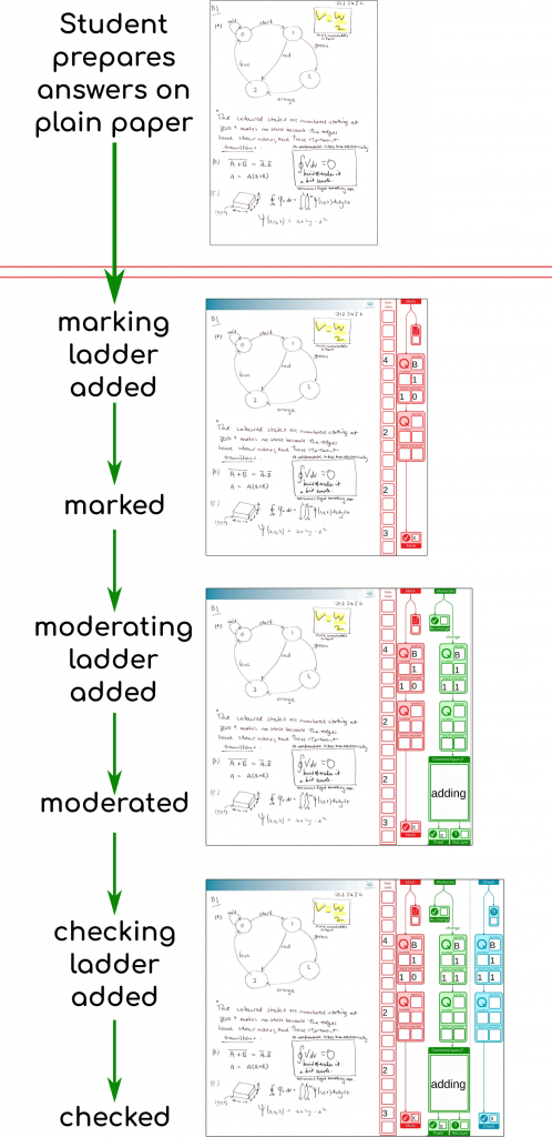
Here’s a couple of the steps shown on their own, showing the moderator has only to check the page if all is ok, but can handle minor issues and communicate them back to the office. If there needed to be additional stages, we’ve got some other coloured “query” and “resolve” sidebars waiting in the wings.
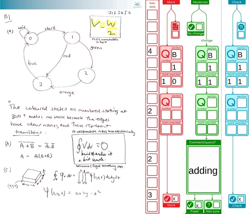
Since we’re going for robustness and safety, we’re rendering all the annotations at each step, exporting to an image file, reimporting that into a new page that has the marking forms added, then exporting that again (phew!) – the stuff in blue all happens in a single command.
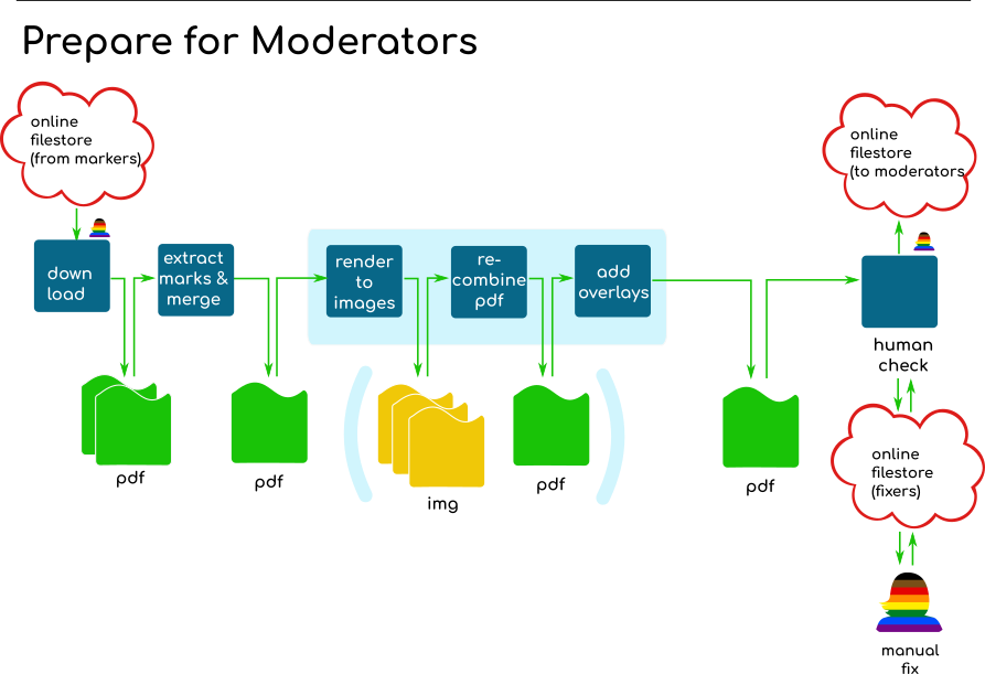
The process in averages around 1.4sec/page/stage at our current quality setting of 90 JPEG quality at 175dpi.
mark             1.3s/page
moderate-active  1.3s/page
check            1.4s/page
The round trip to collect scripts from our exam halls easily comes in at over 45 minutes, or enough time to process about 2,000 pages.
Like all good things, you sometimes struggle to get past the names you liked at various points in the process, and so they stick even when the design aesthetic has moved on.
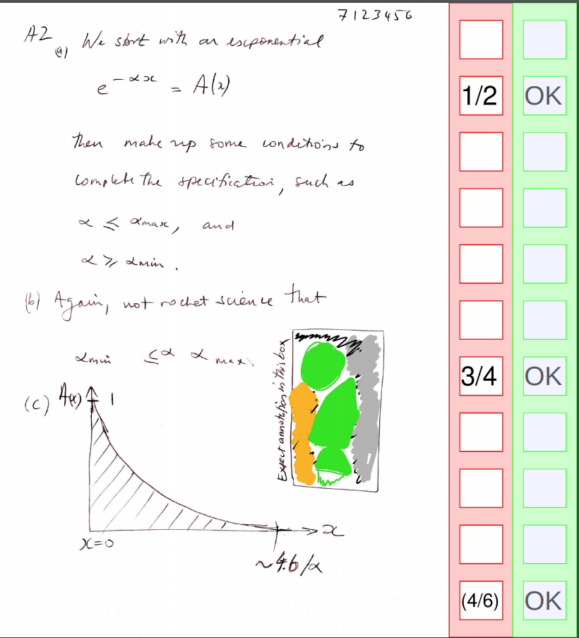
You can tell where the name “ladder” came from when you look at the earliest version shown to colleagues for their feedback (red for marker, green for moderator):
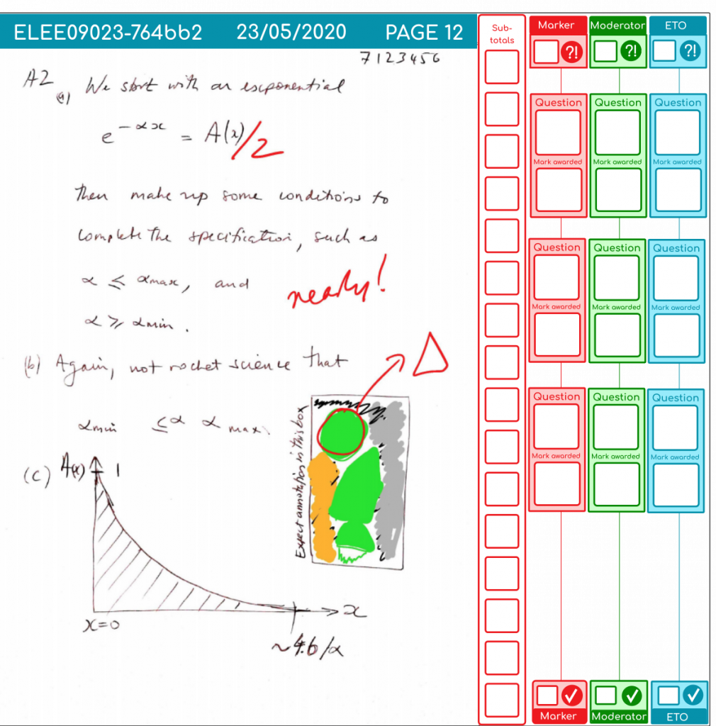
Then I started branching out a bit with the design “flair,” but still handling the box geometry calculations by hand. It was clear that novelty would be limited by how long it took to wield the ruler on screen to line things up and encode the coordinates, but things did start to look a little smarter:
Then I realised that these could be made a bit more self documenting in their design, if I could just put boxes where ever I wanted. It would also mean I could take feedback from colleagues without wincing about how long it would take to recalculate where the boxes go. It was like going back to my first interactive educational computer program (on Venn diagrams, written for a primary school science fair on an IBM XT). Some ~30 years later we can do better than that!
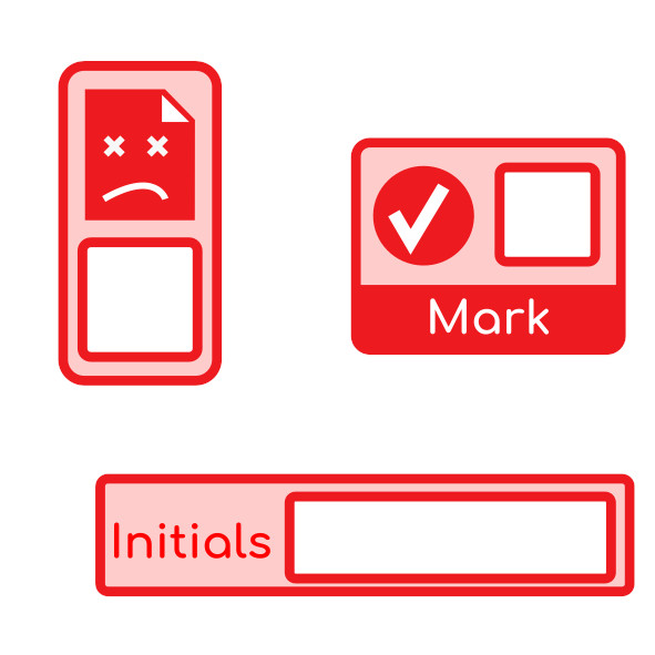
I set myself the challenge of being able to parse the SVG output from Inkscape and autogenerate the acroforms for this sample page with three different size boxes that don’t line up with each other. There’s a video of that in action here, and a picture below:
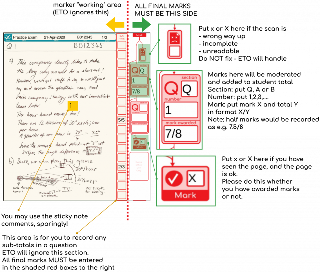
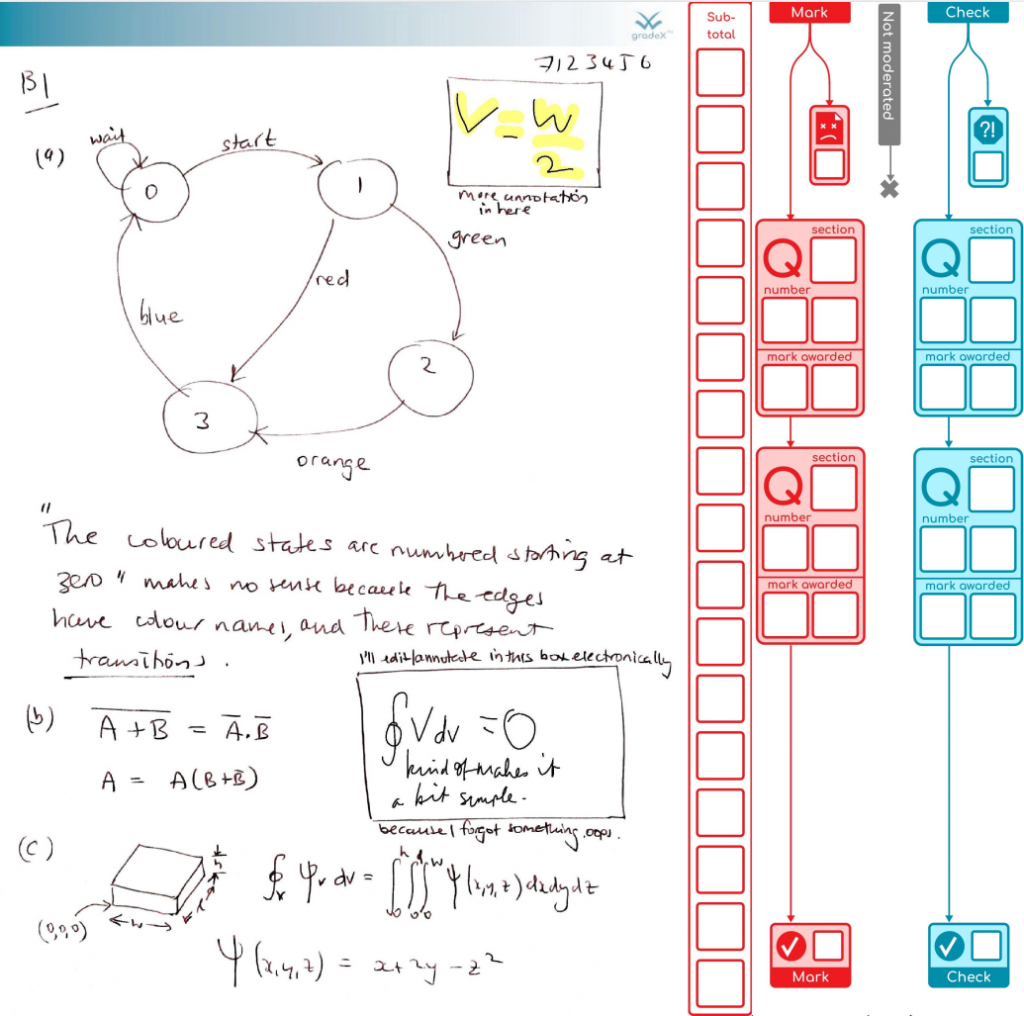
Then I got to work on some more expressive side bars, with an option to include moderation or not. Good user interfaces (even if asynchronous like this) should be self-documenting, ideally. So the vertical lines show that you might indicate the scan was not good, and not do any further marking. Or you might fill in some sub-totals so you can keep track, then tot them up, put them in the Q box, and then tick the ‘page marked’ box. That’s something we can track automagically to make sure every page gets seen.
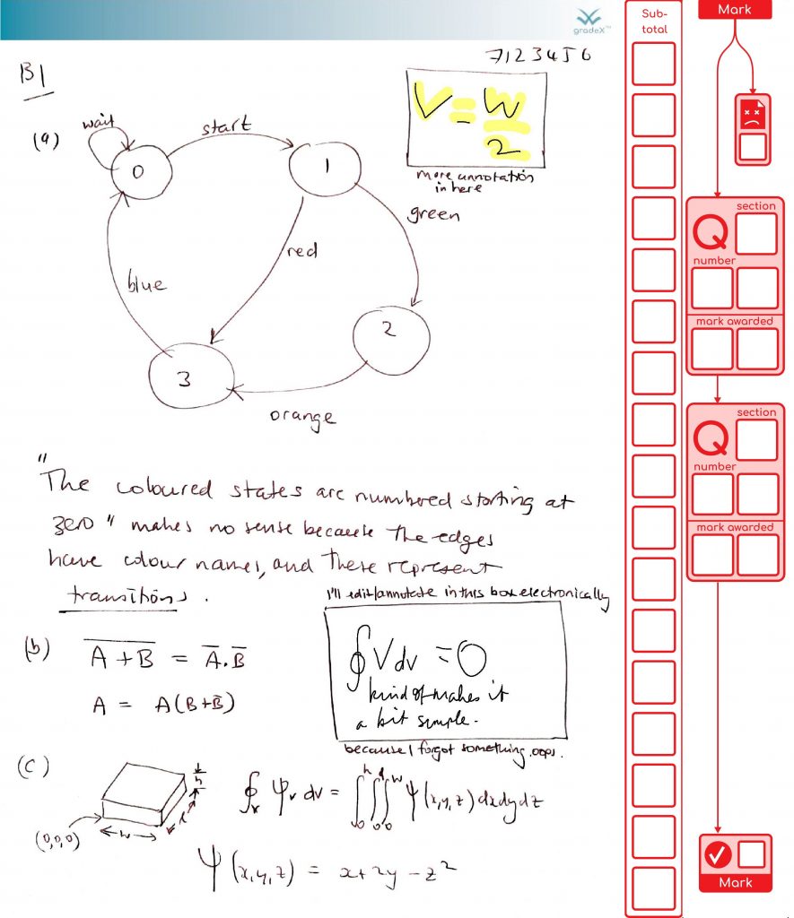
After marking, our office might select this paper for moderation:
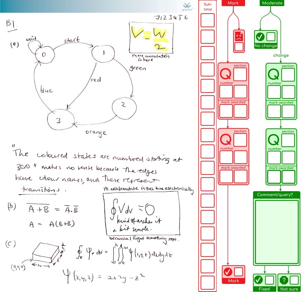
… or you might not .So we can make that more obvious by putting in a visually different sidebar, so we’re not wondering if the moderator left some green boxes blank by accident or not:
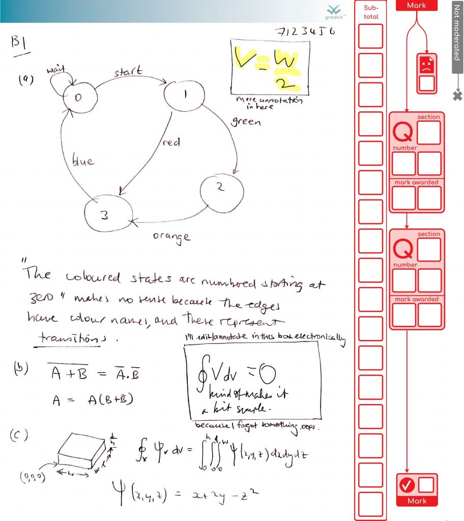
Either way it will be checked afterwards in the office. At this point, it is more likely the entries will be keyed in. Then we can extract the marks and make reports. This sort of approach is likely to be faster than the paper process, and can give you more confidence (e.g. run reports that make sure every page got checked).
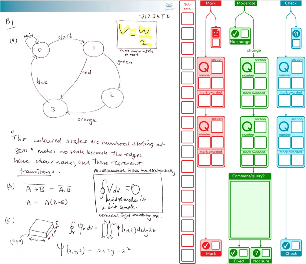
The paper wasn’t moderated, we don’t want the blue bar hanging off in space, so we move it over to the left – that dynamic X-spacing is another reason for the X in pdf.gradex™.
You can imagine further stages for resolving issues, and re-checking. What we do after that are topic(s) for a further post.
This is a proof-of-concept example hot off the press – the first step in marking is to append a sidebar with marking ladder for subtotals, and a marking flow diagram for the total marks for each question that will be formally captured. Or, if the image is unusable, you can flag it for further attention by your support staff, and they will be alerted when they process your marked scripts. If the image is good, you can TAB from box to box, entering marks, leaving your brainpower to focus on the marking task itself rather than how to get the marks onto the page. If you have a tablet or pen display, you can freehand annotate, and these will be safely flattened into images and preserved by the system without risk of erasing them at future steps.
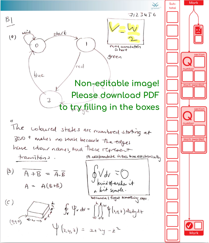
You can download the actual example here . You can edit and save using Adobe Reader, reload and keep going later. Other editors have variable support. For example, you edit and save in Edge, but not Chrome (it lets you edit but not save). If you’re using chrome, like me, feel free to try out the editing side in the browser, just download the form and use a better editor before doing any work you want to keep!
To support additional steps in the process – e.g. for moderating and checking – additional sidebars can be added with different content, designs, colours, names – examples to follow soon!
With multiple people involved in the marking process, they may have different preferred ways of working. So we can mix and match by flattening any annotations that are made on the script.
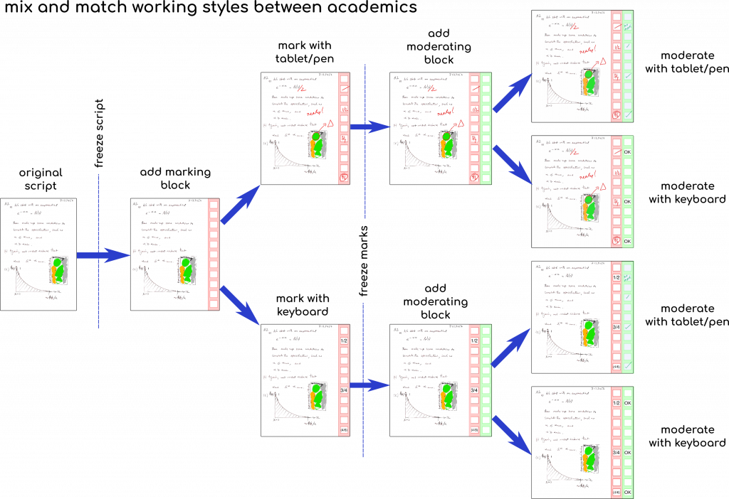
The script “freezing” is using ghostscript to render the original image in the PDF so that it bakes in any annotations that the student has made (e.g. erasing mistakes or adding extra work). This way, the marker cannot accidentally undo the electronic editing that the student did to their own work.
It’s even conceivable to mix in printing, marking and then scanning, although it will require some additional steps in the workflow to match up returning scripts with the metadata in the electronic version (QR codes are one possibility here – topic for a future post).
oh… this will be just like marking on paper, maybe even quicker
an academic colleague
pdf.gradex™ started life in April 2020 as a rapid response to the challenge of getting 50 colleagues to remotely mark 65,000 pages of scanned exams. When wrestling with the best way to get the job done in double-quick time, a bunch of exciting possibilities surfaced – why stop at a one-off patch when we can really benefit in the long term, as an academic community, if we build the tools that suit our local context and help others to do the same?
Edit: just over two months on (June 11), this project is nearing completion of the first phase of development – just a few features to go and a few exams to finish off processing. Here’s an animation that is taken from the git repositories associated with the project, giving an idea of how I managed risk by developing critical features in isolation, then bringing them together in the integrated tool:
What’s in a name?
The X in gradex™stands for
This pdf workflow is just the first “sub-domain” in a broader vision.
But – solved problem, right?
Yep, commercial marking systems are available, but there are good reasons not to settle for them. One of them is that sharing student work with third parties is a sensitive topic. This project aims to make it possible for institutions to keep that data in-house, where it belongs, yet still make significant efficiency, quality and equality improvements to their process. That’s keeping the lights on. What about getting the party on? By putting our code where our mouths are, we can explore the tensions between the latest world-leading research in education and the practical implications of those philosophies and values, without having to somehow keep a boardroom happy too. And how do we invite everyone to party in a way that suits them, or a no-party if that’s your preference? Digital tools always bake-in cultural norms, whether you are aware of it or not. Open-source (with a diverse community) is a necessary condition to overcome that. Of course, “necessary is not sufficient”, but we can’t start without open-source software that underpins the local and wider community. We have a long journey ahead to ensure equality, diversity, and inclusivity for all in education, and education is driven by assessment, so let’s keep that lever out in the open where we can see it and evolve it.
Project status:
Risk management
This system is decoupled completely from student submissions, so we can get on with receiving scanned electronic papers then bring this system in behind that to ease the workflow for markers and administrators. There is no lock-in, because it is just pdf – you can go back to the default human-intensive solution at any time (not that you will want to!)
Potentially interested?
Drop timothy a line (admin AT gradex DOT io) if you want early sight of in-development materials and some chat. Code freely shared already – documentation stills need backfilling, but the initial pre-release version of the command-line version of the tool is on github. If you want to see details of the how things work under the hood, see the parsesvg library for how pages are designed in Inkscape.